Building a strong brand doesn’t start with advertising; it starts with the brand’s DNA. The most powerful way to convey that DNA is through a logo. As a full-service marketing consultancy, Apexia understands that a logo is not just a pretty picture—it is the heart that reflects the brand’s entire identity, mission, and vision. This article will take you behind the scenes of our logo design process, showing how we decoded our brand’s DNA to create a symbol that is both distinctive and powerful.
Why Must a Logo Reflect Brand DNA?

A great logo should be more than a simple symbol for recognition; it must be a “communication tool” that tells the brand’s story instantly. For example, when you see the Apexia logo, you should be able to sense:
- Expertise: Sharp lines and professional-looking elements.
- Trustworthiness: A color palette and shapes that convey stability.
- Innovation: A modern and unique design.
Understanding these values from the outset ensures that the final logo aligns with every piece of brand communication, whether it’s a website, business card, or advertisement.
3 Steps to Decoding Apexia’s Brand DNA

Before any design work began, Apexia went through a 3-step strategic process to discover and define its DNA:
- Define the Brand Core: Who are we? What do we do? And why are we different? Apexia’s core is being a “business navigator” that helps clients reach the peak (Apex) of success.
- Analyze the Target Audience: Who are our clients? What do they expect from us? We found that our clients are entrepreneurs who seek credibility and tangible results. Our logo, therefore, had to convey strength and success.
- Create the Story & Values: How do we want people to remember us? We wanted our logo to tell a story of growth, overcoming challenges, and achieving success together with our clients.
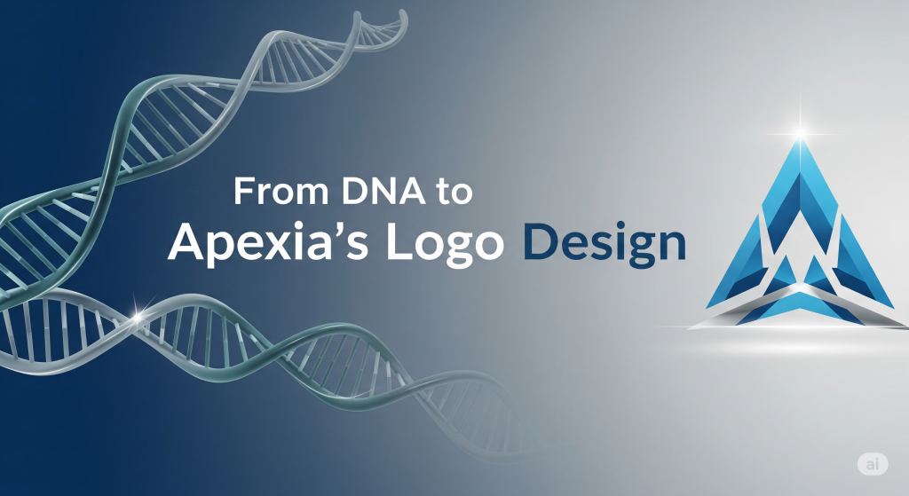
From DNA to Apexia’s Logo Design

With a clear DNA established, we translated these elements into a tangible design:
- Symbol: We chose a symbol that represents a “summit” or “peak,” which aligns with the name Apexia. This symbol is like the ultimate goal our clients can achieve with our guidance.
- Color Palette: We selected colors that evoke trust, professionalism, and modernity to create a strong first impression.
- Typography: The font we chose is simple, sharp, and strong, reflecting our commitment to stability and clarity in our work.
Building a Strong Brand Starts with Your Logo… and Your DNA

The Apexia logo is more than just an image; it is the result of a deep understanding of our brand’s core. Creating a powerful logo isn’t just about feeling—it requires a profound strategic process. If you’re looking for a logo that truly reflects your brand’s identity and are ready to embark on a journey to success in the business world, Apexia is the answer.